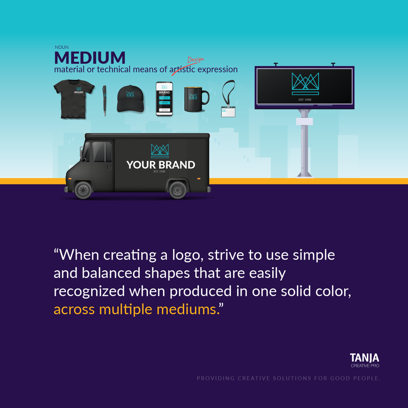
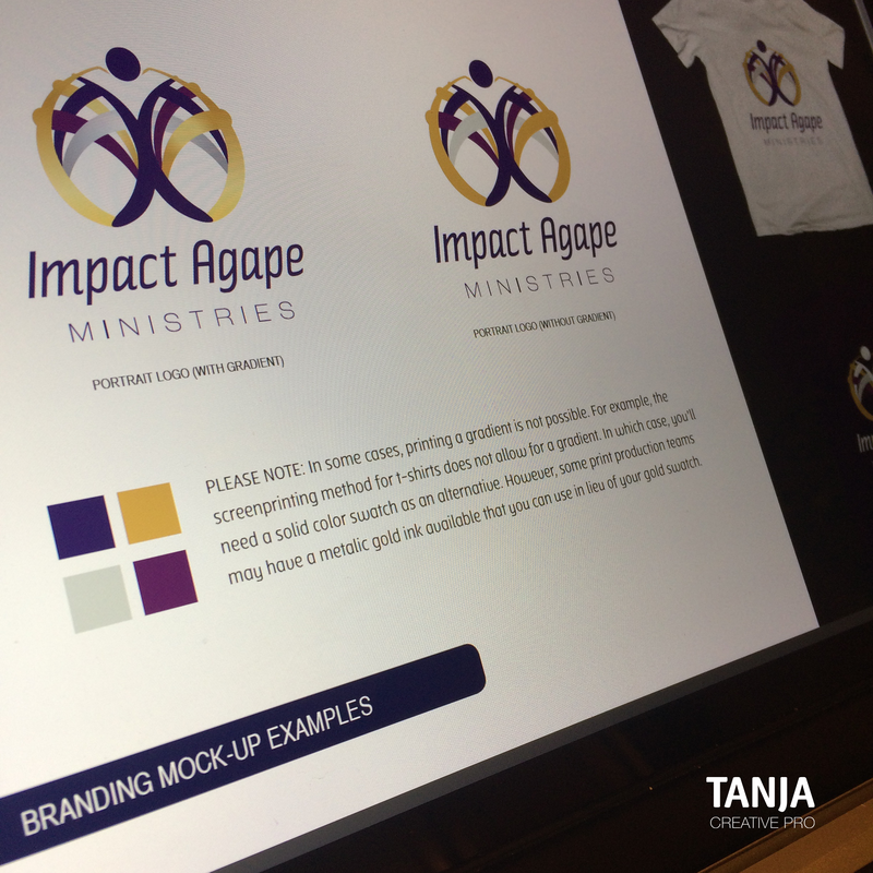
1.) SimpleWhich would you liken a Logo Design to, a Painting or a Signature? If you answered Painting, I get it! You're excited about starting your business and you want a logo design that will really stand out to your clients/customers. You want the works! Drop shadows, gradients, sparkle and maybe even glitter (if that's your thing). However, your logo design isn't meant to function as a flyer or a mural. Instead of a painting, think of your logo as the signature placed in the bottom, right corner of your painting. Your logo should not distract or compete with the product, service, or message you're trying to convey. It should, however, compliment your message and thread a subtle string of continuity throughout all your marketing assets. When creating a logo design, strive to use simple and balanced shapes that are easily recognized when produced in one solid color, across multiple mediums. 2.) VersatileAt the beginning stage of building your Brand's foundation, try focusing more on function rather than creativity. While you're encouraged to think outside of the box, also consider how your creative ideas will function once implemented into your real-world workflow or marketing efforts. Your logo design should be capable of being produced across multiple mediums; inside of a vertical or horizontal format. How will your logo design look at a very small or large scale? Can it function on a dark background and light background? Gradients, drop shadows, and other graphic treatments may ignite excitement when reviewing logo examples, but those treatments should be used with caution. It's best to stay away from such treatments if you or someone on your staff aren't equipped with the knowledge to make sound production decisions. The image below is an example of how Tanja Creative Pro strategically produced a logo design that includes gradients. 3.) TimelessTrends come and go quickly. In the world of fashion design, trendy colors, fabrics and styles are in high demand for a season, but don't always stand the test of time. The same holds true in the world of Communication Design. When selecting graphic treatments or typefaces for your logo it's important not to overcommit to a trend that may not last beyond 1-3years. Relying too heavily on trendy techniques could result in an outdated logo design once the trend is no longer popular. It's normal to update your logo design every couple of decades; on the contrary, one may lose a lot of brand equity by updating a logo design every 1-3 years. Apply the KISS rule. Less is more! 4.) RelevantSpeaking of Keeping It SMART and simple; a goal cannot spell SMART without the letter R –Relevant. The typeface and graphics used in a strong logo design should accurately represent your company's name and brand persona. An efficient use of time and resources should go toward producing a logo design that is relevant to the industry being served. If your company's archetype is "The Caregiver" then your graphics and/or typeface should graphically communicate a caring undertone. 5.) RecognizableClear communication is not limited to written and verbal expression. If the graphic or typeface representing your company aren't clear, it becomes difficult for the viewer to recognize. If graphics are difficult to recognize they become tough to remember. One of the most difficult challenges in producing a strong logo design is representing a cumbersome brand persona in the most simplified symbol possible.
|
About The BlogThis space will allow you access to the process of bringing ideas to life, as well as an opportunity to learn more about the creative personality behind it all. Archives
May 2022
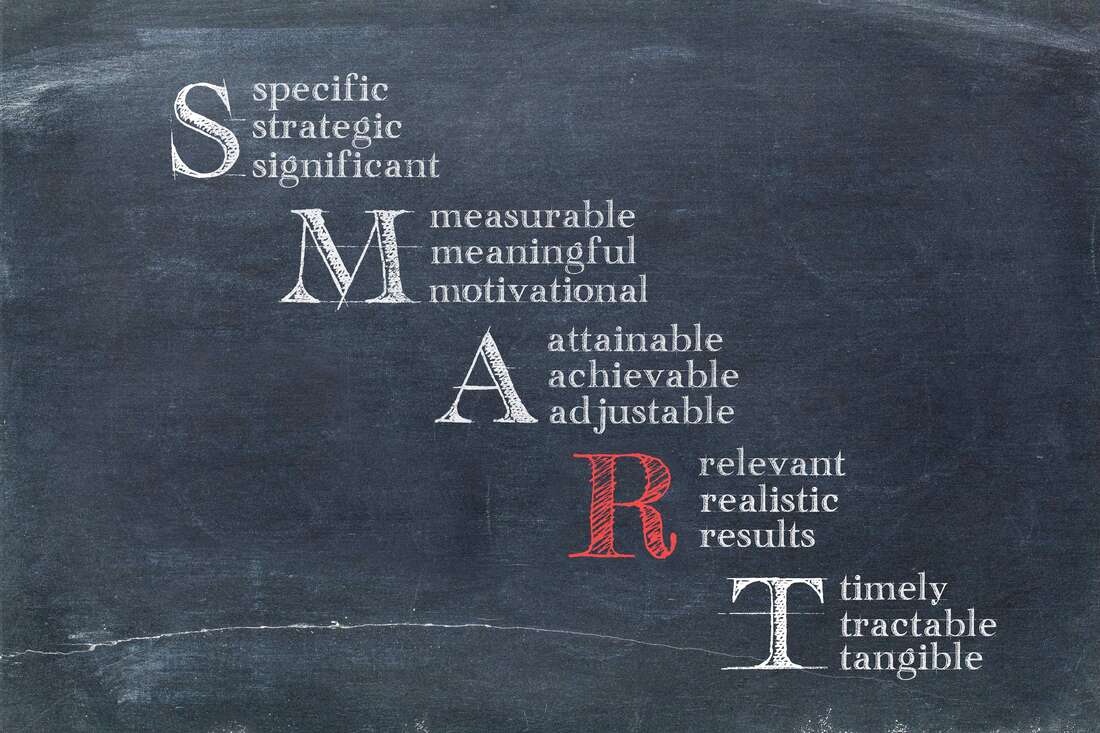
Categories
All
|


 RSS Feed
