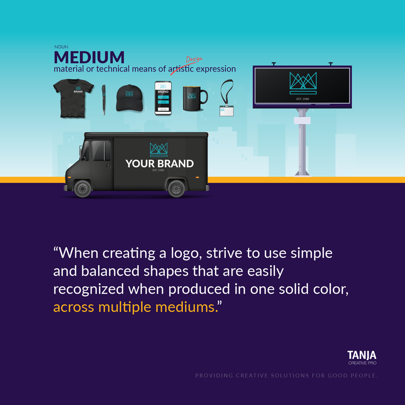
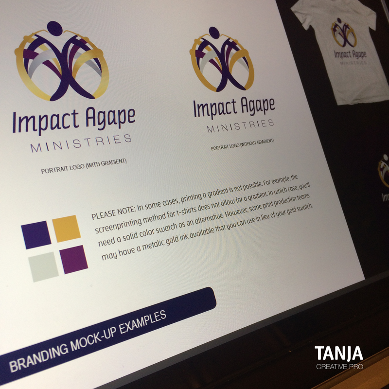
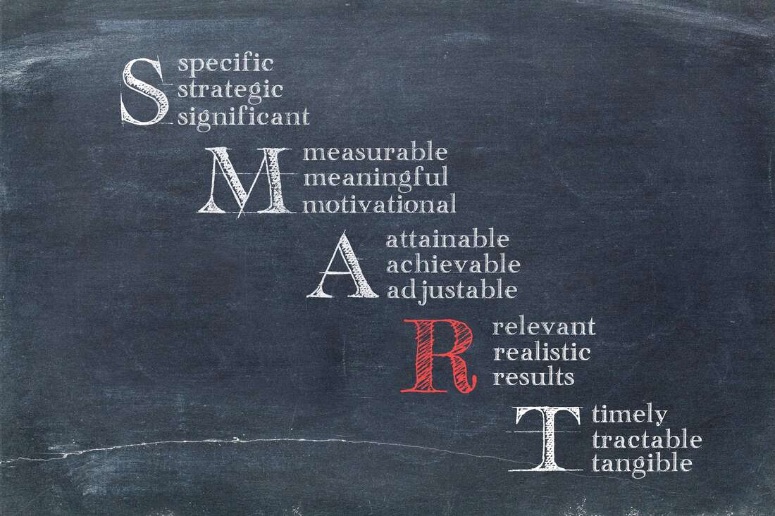
1.) SimpleWhich would you liken a Logo Design to, a Painting or a Signature? If you answered Painting, I get it! You're excited about starting your business and you want a logo design that will really stand out to your clients/customers. You want the works! Drop shadows, gradients, sparkle and maybe even glitter (if that's your thing). However, your logo design isn't meant to function as a flyer or a mural. Instead of a painting, think of your logo as the signature placed in the bottom, right corner of your painting. Your logo should not distract or compete with the product, service, or message you're trying to convey. It should, however, compliment your message and thread a subtle string of continuity throughout all your marketing assets. When creating a logo design, strive to use simple and balanced shapes that are easily recognized when produced in one solid color, across multiple mediums. 2.) VersatileAt the beginning stage of building your Brand's foundation, try focusing more on function rather than creativity. While you're encouraged to think outside of the box, also consider how your creative ideas will function once implemented into your real-world workflow or marketing efforts. Your logo design should be capable of being produced across multiple mediums; inside of a vertical or horizontal format. How will your logo design look at a very small or large scale? Can it function on a dark background and light background? Gradients, drop shadows, and other graphic treatments may ignite excitement when reviewing logo examples, but those treatments should be used with caution. It's best to stay away from such treatments if you or someone on your staff aren't equipped with the knowledge to make sound production decisions. The image below is an example of how Tanja Creative Pro strategically produced a logo design that includes gradients. 3.) TimelessTrends come and go quickly. In the world of fashion design, trendy colors, fabrics and styles are in high demand for a season, but don't always stand the test of time. The same holds true in the world of Communication Design. When selecting graphic treatments or typefaces for your logo it's important not to overcommit to a trend that may not last beyond 1-3years. Relying too heavily on trendy techniques could result in an outdated logo design once the trend is no longer popular. It's normal to update your logo design every couple of decades; on the contrary, one may lose a lot of brand equity by updating a logo design every 1-3 years. Apply the KISS rule. Less is more! 4.) RelevantSpeaking of Keeping It SMART and simple; a goal cannot spell SMART without the letter R –Relevant. The typeface and graphics used in a strong logo design should accurately represent your company's name and brand persona. An efficient use of time and resources should go toward producing a logo design that is relevant to the industry being served. If your company's archetype is "The Caregiver" then your graphics and/or typeface should graphically communicate a caring undertone. 5.) RecognizableClear communication is not limited to written and verbal expression. If the graphic or typeface representing your company aren't clear, it becomes difficult for the viewer to recognize. If graphics are difficult to recognize they become tough to remember. One of the most difficult challenges in producing a strong logo design is representing a cumbersome brand persona in the most simplified symbol possible.
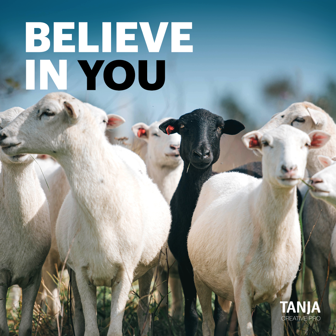
Being different will always take courage. You will appear to be an easy target. At time you may feel like the odd one out. However, do not doubt your worth, don't doubt your vision, don't doubt who you are simply because you're different. You have a point of view that will provide solutions to problems that no one else can solve.
Resist the temptation of fitting in. Believe In You. In the photo above, we see the power of Graphic Design at work. Designers visually communicate complex information and/or sentiments that are often too complicated to express in a simple way. The photograph, when coupled with strategic text, color and placement can express in one thousand words how it may feel to "Believe In You". Believing in your vision can often feel like you're going at it alone. It's tough to know who is truly out to serve you without exploiting your budget. At Tanja Creative Pro, I focus on empowering good people with resources that will allow them to lay a strong foundation using Start-Up Branding Solutions. I'll educate and equip you with what you absolutely need from a creative professional, while also providing you with resources to do what you choose to do yourself. Why? Simply because I know how challenging it is to Believe In Your Vision, and I'm not here to create any additional resistance along your journey. Create Well. Believe In You! Sometimes you have to make time to explore your day-to-day tools in a new way. I took a few moments away from creating someone else's Brand Identity, to try a new technique. Trying something new is a great way to add a little flavor to your existing skillset. Check out the video below! (Created using: Adobe Illustrator and Photoshop CC) As I spoke with a group of teenagers last week, I encouraged them to be mindful of the messages they allow beyond their ear-gate and their eye-gate. Although toxic information and sometimes misinformation is easily accessible, we must continue to exercise our muscle of choosing well. What we feed our minds will become the information we use to either solve problems or create problems. It will be what is used to remind us we're loved or we're hated. It will be what motivates us to press beyond obstacles or allow obstacles to overtake us.
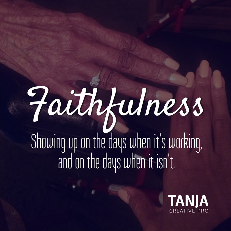
As someone whose livelihood is depending on how well I produce creative solutions, I had to learn the importance of managing my energy space. If clarity in thought and a balance spirit is necessary for creating simple things like graphics and web solutions, imagine the impact a clear, positive mind can have on the world we're now living within. SHOWING UP ON THE DAYS WHEN IT'S WORKING, AND ON THE DAYS WHEN IT ISN'T.
If you’ve ever started building anything from scratch —whether it’s a family, a business, a building, or a work of art—you’ll reach a point somewhere in the process where your “faithfulness” will be tested. That point where your initial excitement to begin building is stifled by the unexpected challenges and/or set-backs you encounter while building. The point where the results aren’t matching the level of effort. The point where a loved one gets sick at the most inopportune stage of growth. The point where the very thing you’re trying to help is causing the most inconvenience and resistance in your life. When I find myself at this point, I revisit the reason why I started. If my initial intentions are rooted in a place of love, service and purpose, then I know I must find a way to recalibrate and continue forward. If my initial intentions are rooted in ego, pride or greed; I still find a way to recalibrate and continue forward —only this time, in truth. “My brethren, count it all joy when you fall into various trials, knowing that the testing of your faith produces patience. But let patience have it’s perfect work, that you may be perfect and complete, lacking nothing.” (James 1:2-4) Throughout our journey of building, we'll find that the thing we’re trying to build is also building us. It’s our faithfulness to the vision placed within us that determines whether or not we’re successful. The number of sales, number of clients, number of likes/followers will become irrelevant if we learn to refocus our attention on serving the vision with excellence —despite the results. Our commitment to what we have will determine how much more we can handle. #CreateWell
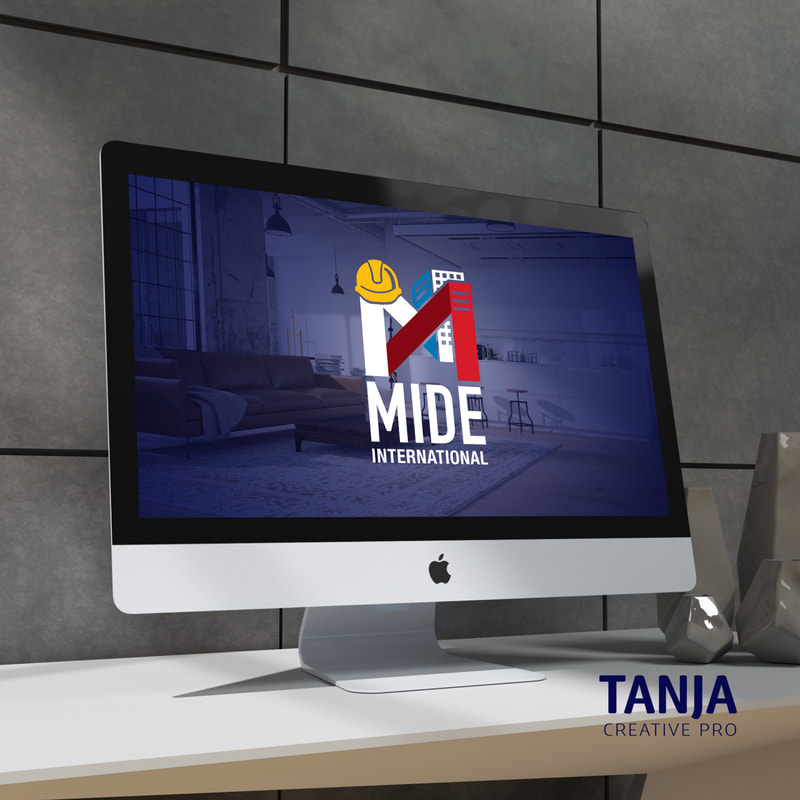
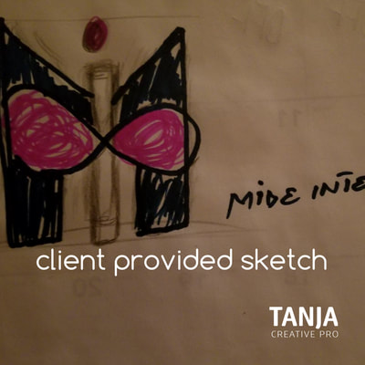
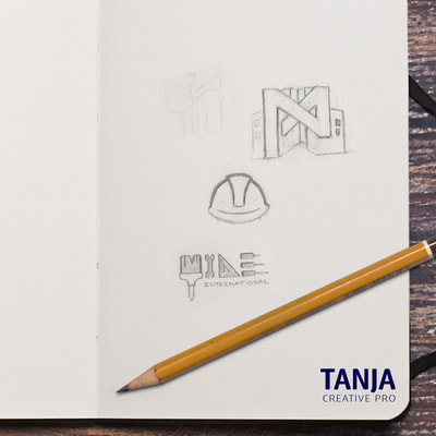
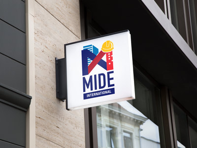
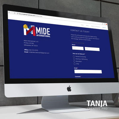
Logo Creation Process for Mide International (Two concepts were presented. Client selected concept above.)
|
About The BlogThis space will allow you access to the process of bringing ideas to life, as well as an opportunity to learn more about the creative personality behind it all. Archives
May 2022
Categories
All
|

 RSS Feed
